Aggregate values chart
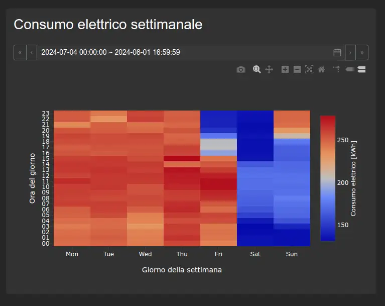
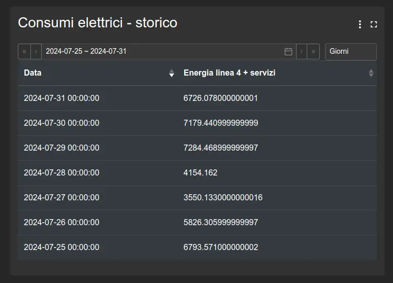
Analyzes and compares historical data by applying statistical or aggregation functions over a time range. Results can be presented as a line or bar chart, table, heatmap, or pie chart.
Its configuration defines sources, aggregation interval and function, dimensions, series, and axes.

Configuration
This widget uses the following common settings:
- selecting variables and time range;
- aggregation interval, time zone, and aggregation type;
- calculated variables;
- line options;
- axes;
- interactions;
- events.
Specific settings
The Type tab defines the visualization and how data is arranged in the chart.
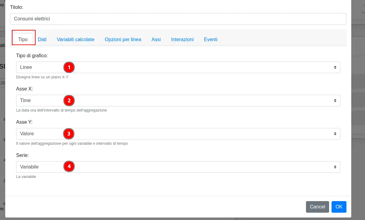
- Chart type selects the visualization to use.
- X axis determines which dimension is placed on the horizontal axis.
- Y axis determines which dimension is placed on the vertical axis.
- Series determines how data is divided into separate series.
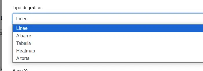
The available types are line, bar, table, heatmap, and pie. Configurable dimensions change according to the selected type; for example, a heatmap uses day of week and hour of day, while a pie chart uses area and series.
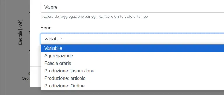
Series can be divided by variable, aggregation, time band, manufacturing batch, manufacturing product, or manufacturing order. Selecting a manufacturing dimension also requires a machine; selecting Time band lets you define the bands to use.